
BaByliss Pro Website
Overview
Sometimes a simple bit of organisation makes the world of difference.
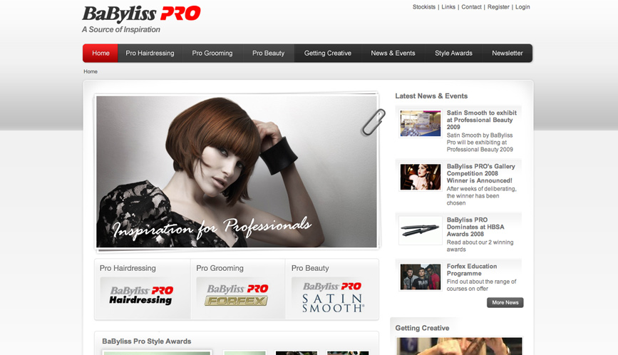
When Babyliss came to us late last year they were in a bit of a dilemma with their Digital offering for their professional arm of the company - BaByliss Pro. Despite having an abundance of content and some good intentions, we identified a key problem when playing around with their site - we got lost.
Focusing on the information architecture, we stripped back the areas on the site to Product Showcase area, Demos and Tips, News and a user generated content section. With the notion of 'simplifying' in mind, we designed a clean, structured interface to compliment the approach. Another crucial factor of the site's success, was putting in place clear navigation to ensure a structured user journey which guided the consumer to relevant content on the site.
Both ourselves and BaByliss are really happy with the result and after a few months surrounded by styling products, we've noticed many of the boys in the office scrubbing up their style.